Let it go, let it go
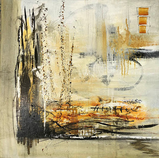
Okay! Today I finally gave myself TOTAL permission to play. I decided to start with just two colors, black and Nickel Azo Gold, and mark the heck out of the canvas to see which marks worked for me and which just... don't.
The results may not appeal to you, but they are actually quite inspiring for me -- partly because I love the way those two colors work together, but also because I learned some new marks and discovered some preferences I didn't realize I had.
I know. It's basically an unholy muddy mess! But I love the long thin black marks on the upper left, the ones that look a bit like cat-tails or wheat stalks.
The black fence-like thing, or railroad tracks, lower right? WAY too thick.
I love the three squares at the top, and the way they look like old-fashioned sails.
I tried putting a big blob of black in the middle and hated it.
I think the splatters would have been cooler if they were white.
I'm getting better at controlling drips.
 I like the way the gold and black work together; that's a very cool color (in the I-like-it sense, not the blue vs red sense).
I like skinny marks more than fat marks. And circles? At least in this composition, not so much.
So yeah: probably not posting this one on instagram, but still -- what fun!
Maybe this time is a chance for all of us to sing that song from Frozen: Let it go, let it go... and see where it takes you!
PS: I've worked on this some more, to see if I can turn it into something postable. I suspect that's teaching me a few things, too: it's fun to compare, see what I prefer...
The results may not appeal to you, but they are actually quite inspiring for me -- partly because I love the way those two colors work together, but also because I learned some new marks and discovered some preferences I didn't realize I had.
I know. It's basically an unholy muddy mess! But I love the long thin black marks on the upper left, the ones that look a bit like cat-tails or wheat stalks.
The black fence-like thing, or railroad tracks, lower right? WAY too thick.
I love the three squares at the top, and the way they look like old-fashioned sails.
I tried putting a big blob of black in the middle and hated it.
I think the splatters would have been cooler if they were white.
I'm getting better at controlling drips.
 I like the way the gold and black work together; that's a very cool color (in the I-like-it sense, not the blue vs red sense).
I like skinny marks more than fat marks. And circles? At least in this composition, not so much.
So yeah: probably not posting this one on instagram, but still -- what fun!
Maybe this time is a chance for all of us to sing that song from Frozen: Let it go, let it go... and see where it takes you!
PS: I've worked on this some more, to see if I can turn it into something postable. I suspect that's teaching me a few things, too: it's fun to compare, see what I prefer...


Comments
Post a Comment